Status Page Examples That Do It Right
- Watchman Tower Team
- Updated: July 19, 2026
- Category: Status Page
- Read Time: 2 min
Strong status page examples show more than design taste. They show how teams communicate reliability clearly when customers need answers.
Downtime is unavoidable, but chaos is not. The best status pages turn stressful moments into clear communication. They help users understand what is affected, whether the problem is ongoing, and where to look for updates next.
Why Status Pages Matter
When your system has issues, users do not only want technical detail. They want clarity. A well-designed status page provides:
- Transparency during incidents and recoveries
- Live service visibility that answers “Is this just me?”
- Historical context through uptime and incident history
- A calmer support experience because users can self-serve answers
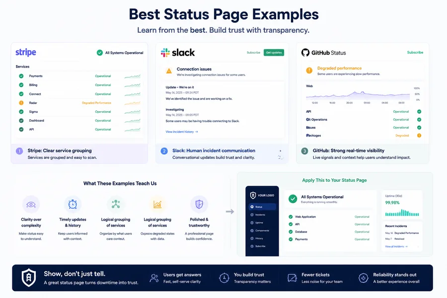
1. Stripe: Clear service grouping
Stripe’s status page is minimal but effective because it breaks services into understandable groups. Instead of one vague system message, users can quickly see which areas are healthy and which ones are degraded.
2. Slack: Human incident communication
Slack uses a more conversational tone in incident updates. That human layer matters. It makes technical issues easier to follow and helps users feel like the company is actively present.
3. GitHub: Strong real-time visibility
GitHub pairs status updates with live operational signals. That extra context helps users confirm when a slowdown is real, when recovery has started, and why the incident matters.
What These Examples Teach Us
Even though these pages look different, the strongest ones usually share the same principles:
- Clarity over complexity
- Visible incident history and timely updates
- Logical grouping of services or components
- Enough performance context to explain degraded states
- A presentation that feels polished and trustworthy
How to Apply This to Your Own Status Page
You do not need a huge team to create a strong status page. What matters is showing the right information in the right order: overall status first, grouped services second, incident history third, and enough branding that the page feels official during high-pressure moments.
With Watchman Tower, that can mean a public page with grouped monitored items, incident history, uptime visibility, and a more polished branded presentation than the typical generic status utility.
If you are still deciding what a status page should contain, start with What Is a Public Status Page?. If you want the business case, continue with Why Every SaaS Needs a Status Page.
Conclusion: Show, Don’t Just Tell
A great status page does not just say “we are investigating.” It shows users that you know what is affected, you are communicating consistently, and you take reliability seriously.
Whether you are a startup or a mature SaaS platform, the best status pages create trust by making service health visible, understandable, and easy to follow.
Free plan available. No credit card needed.
FAQ
Why are status pages important?v
What makes Stripe's status page effective?v
How does Slack communicate incidents on their status page?v
What is notable about GitHub's status page?v
What principles do the best status pages share?v
How can I create an effective status page without a large team?v
Blog Posts

Custom Domains and Google Tag Manager Integration for Your Status Page...
Custom domains and analytics make status pages feel like a real product surface instead of a generic incident page. This guide explains why that matters.
Learn more about Custom Domains and Google Tag Manager Integration for Your Status Page
Why Every SaaS Needs a Status Page...
SaaS teams need status pages because incidents are communication problems as much as technical ones. This guide explains why they matter before, during, and after outages.
Learn more about Why Every SaaS Needs a Status Page
What Is a Public Status Page? Purpose, Benefits, and Best Practices...
A public status page is not just a broadcast surface. It is part of how teams communicate reliability, incidents, and trust in a visible way.
Learn more about What Is a Public Status Page? Purpose, Benefits, and Best Practices