Average Response Time vs Percentile Metrics: Why Averages Hide API Performance Problems
- Watchman Tower Team
- Updated: July 24, 2026
- Category: Response Time Monitoring
- Read Time: 8 min
Average response time can hide user pain. This guide explains why percentile metrics are critical when teams want latency visibility that reflects real experience.
Response time is one of the first metrics people look at when evaluating application performance.
Whether you're monitoring an API, a website, or an internal service, the dashboard usually starts with a single number: the average response time.
At first glance, it seems like a reasonable indicator. If the average response time is low, the system appears healthy.
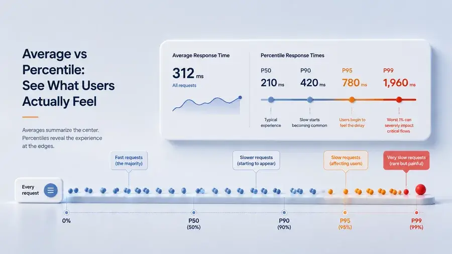
The problem is that averages only describe the center of the data. They say very little about the requests that users are most likely to remember.
A handful of slow requests can delay a checkout process, interrupt an API integration, or make a page feel unreliable—even while the average response time remains comfortably within your target.
This is why modern monitoring platforms rely on percentile metrics alongside averages. Rather than summarizing every request into a single value, percentiles reveal how response times are distributed across real traffic.
Understanding the difference between average response time and percentile metrics is essential for anyone responsible for application performance or operational reliability.
Average Response Time vs Percentile: What's the Difference?
Although both metrics measure response time, they answer fundamentally different questions.
| Metric | Answers |
|---|---|
| Average response time | How fast were requests overall? |
| Percentiles (P50, P90, P95, P99) | How fast were most requests, and how slow were the worst ones? |
Neither metric is inherently better than the other. They simply describe performance from different perspectives.
An average summarizes all requests into one number. Percentiles reveal how those requests are distributed, making it easier to understand whether slow responses are isolated incidents or part of a broader performance problem.
Why Average Response Time Can Be Misleading
Average response time is calculated by adding the duration of every request and dividing the total by the number of requests.
It answers a simple question:
"What was the average response time across all requests?"
What it does not answer is often more important:
"Did some users experience significantly slower responses than everyone else?"
In real production systems, response times are rarely distributed evenly. Most requests complete quickly, while a small percentage take much longer because of database queries, cache misses, third-party dependencies, network latency, or temporary traffic spikes.
These slower requests are often called tail latency. Although they represent only a small fraction of total traffic, they can have a disproportionate impact on user experience.
Looking only at the average response time can hide:
- Short-lived performance spikes
- Latency introduced by external dependencies
- Regional performance differences
- Traffic-related degradation
- Intermittent infrastructure bottlenecks
In other words, an application can appear healthy on paper while a meaningful percentage of users experience noticeable delays.
A Simple Example: When the Average Hides the Problem
Imagine your monitoring system records these response times during one minute:
250ms
260ms
270ms
290ms
300ms
310ms
320ms
330ms
340ms
3000ms
The average response time is approximately 462 ms.
At first glance, that doesn't seem alarming.
But one request took 3 seconds.
For the user waiting for a payment confirmation, login response, or search result, that request defines the experience far more than the average ever will.
This example illustrates the main limitation of averages:
Averages describe the center of the data. They rarely describe the experience of the slowest users.
How Percentile Metrics Work
Percentile metrics approach response time from a different perspective.
Instead of combining every request into a single average, they measure how response times are distributed across all requests.
This makes it much easier to understand what most users experience and how severe the slowest requests actually are.
A percentile represents the response time below which a certain percentage of requests completed.
For example:
- P50 means 50% of requests completed at or below that response time.
- P90 means 90% of requests completed at or below that response time.
- P95 means 95% of requests completed at or below that response time.
- P99 means 99% of requests completed at or below that response time.
Unlike averages, percentiles don't smooth out unusually slow requests. Instead, they show where those requests begin to affect real users.
Why Distribution Matters More Than a Single Average
Imagine two services with the same average response time of 300 ms.
Looking only at the average, they appear equally healthy.
In reality, they may behave very differently.
| Metric | Service A | Service B |
|---|---|---|
| Average | 300 ms | 300 ms |
| P95 | 340 ms | 1,250 ms |
| P99 | 410 ms | 2,900 ms |
The averages suggest both services perform similarly.
The percentile metrics tell a different story.
Service A delivers consistently predictable performance, while Service B experiences significant tail latency that affects a small but important percentage of requests.
This is why engineering teams often rely on percentile metrics when evaluating service reliability. They reveal performance variability that averages naturally hide.
P50, P90, P95, and P99: When Should You Use Each?
Different percentiles answer different operational questions.
| Metric | Best Used For |
|---|---|
| P50 | Understanding typical day-to-day performance. |
| P90 | Detecting early signs of user-facing slowdowns before they become widespread. |
| P95 | Evaluating production performance and overall service reliability. |
| P99 | Investigating rare but severe latency spikes and edge cases. |
None of these metrics replaces the others.
Together, they provide a much richer understanding of application behavior than any single response time metric can offer.
Why P95 Response Time Has Become the Standard
Among all percentile metrics, P95 response time has become one of the most widely used indicators in production monitoring.
It strikes a practical balance between everyday performance and the slowest requests.
P50 focuses on the median user experience, but it can overlook users experiencing slower requests.
P99 highlights the most extreme cases, but those requests may represent only a very small portion of traffic.
P95 sits between those two perspectives.
It captures the response times experienced by almost every user while remaining sensitive enough to expose emerging performance problems before they become widespread incidents.
For this reason, P95 is commonly used in service level objectives (SLOs), performance monitoring dashboards, and operational reviews.
Average vs Percentile: Which Metric Should You Trust?
The answer is not choosing one over the other.
Reliable monitoring depends on understanding what each metric contributes.
| Metric | Best Answers |
|---|---|
| Average response time | Is overall performance improving or declining? |
| P50 | What does a typical request look like? |
| P90 | Are slower requests becoming more common? |
| P95 | How many users are beginning to experience noticeable latency? |
| P99 | How severe are the worst-performing requests? |
Average response time is valuable for identifying long-term trends.
Percentiles provide the operational visibility needed to understand how those trends affect real users.
Together, they offer a far more complete picture of application performance than either metric can provide alone.
What Is a Good Response Time Benchmark?
There is no universal response time benchmark.
An acceptable response time depends on the type of service, user expectations, and the operational impact of delays.
For example, an internal reporting dashboard may tolerate response times that would be unacceptable for a payment API or an authentication service.
Instead of asking, "What response time is considered good?", a more useful question is:
"At what point do slower responses begin affecting users or business operations?"
Once that threshold is defined, percentile metrics become much more meaningful because they show how often users cross that boundary—not simply what the average response time happens to be.
This is one reason why many engineering teams build performance objectives around percentile metrics rather than averages alone.
Putting These Metrics Into Practice
Measuring response time is only useful if it helps teams make better operational decisions.
Dashboards filled with averages may look reassuring while performance gradually degrades underneath.
By combining average response time with percentile metrics, teams gain a much clearer understanding of how systems behave under normal conditions, traffic spikes, and unexpected failures.
That visibility makes it easier to:
- Detect performance degradation before it becomes a widespread incident.
- Distinguish isolated latency spikes from systemic problems.
- Evaluate whether optimization efforts improve the experience for most users.
- Identify reliability trends over time instead of reacting to individual incidents.
This is the reason modern monitoring platforms increasingly emphasize percentile-based performance analysis rather than relying on a single average response time metric.
How Watchman Tower Supports Response Time Analysis
Understanding response time requires more than collecting numbers.
Teams need enough context to determine whether a slower response represents a temporary fluctuation, a developing performance issue, or the beginning of a broader operational incident.
Watchman Tower helps provide that context by continuously monitoring response times, availability, and historical performance trends so that changes can be understood over time rather than in isolation.
Instead of focusing on a single number, operational teams can investigate how performance evolves, identify recurring latency patterns, and understand when user-facing reliability begins to decline.
The goal is not simply to report response times—it is to make performance changes easier to interpret before they become customer-visible incidents.
Key Takeaways
- Average response time summarizes overall performance but can hide slow user experiences.
- Percentile metrics reveal how response times are distributed across real requests.
- P90 and P95 help identify emerging performance degradation before averages noticeably change.
- P99 exposes rare but severe latency events that often affect critical user journeys.
- The most effective monitoring strategy combines averages and percentiles instead of relying on either metric alone.
Monitoring becomes far more valuable when you stop asking only "What was the average response time?" and begin asking "How many users experienced slow responses?"
Free plan available. No credit card needed.
FAQ
Why can average response time be misleading for API performance?v
Can you give an example of how average response time hides slow requests?v
What do percentile metrics like P95 and P99 show in API monitoring?v
Should I use average response time or percentile metrics for API monitoring?v
Why are percentile metrics critical for understanding real user experience?v
How can I monitor API performance beyond averages?v
Blog Posts

API Response Delay Threshold: Why Fast Responses Matter as Much as Uptime...
An API can return 200 OK and still feel broken to users. This guide explains why response delay belongs inside a broader health view, not just uptime reporting.
Learn more about API Response Delay Threshold: Why Fast Responses Matter as Much as Uptime
How Watchman Tower Uses Real Response Time Monitoring to Reveal True Website Performance...
Response time monitoring matters because systems can be technically up while functionally frustrating. This guide shows why latency belongs inside a broader health view.
Learn more about How Watchman Tower Uses Real Response Time Monitoring to Reveal True Website Performance